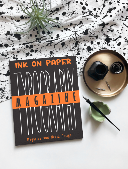
Ink On Paper
Typography Magazine and Branding
This project was to create a two-spread magazine that is based on the history of typography. The process started with creating the masthead and publication, which in this case is called Ink on Paper. With the name of the publication, came the decision of the styling and typography, which everything needed to have that handwritten feeling and be cohesive in that sense. The history of typography was an easy spread to execute, but the came the question of what else to cover in this magazine.
Then came the idea of evolution - on the second spread, features the evolution through an alphabet. Starting at the beginning with A, was the very first typeface to be born, going all the way to Z, being the most modern typeface that is used today. The masthead and the font on the cover is all hand illustrated, while the other fonts had been edited and manipulated into my own. The theme and colors of this magazine came from wanting to keep it simple, so the typography could take over the design.

Mockup #1 of the cover

Mockup #2 of the Cover

Mockup of the inside spread

Front Cover of the Magazine

Pages 2-3 of the Magazine

Pages 4-5 of the Magazine

